TOWN GREEN

Driving Early Engagement for a Major Urban Development

OVERVIEW

The Town Green project represents a US $180 million mixed-use development in Scotts Valley, California, designed to bring together housing, retail, restaurants, public art, and green spaces. As the development team prepared for the community’s first event, they needed a digital platform to inform residents, collect interest, and build an early subscriber base. I was tasked with building that platform from scratch.

GOAL

Launch a clean, responsive, mobile-first website in two weeks, in time for the first community event, and collect contact information from visitors to allow the development team to communicate updates as the project evolves.

ROLE

I served as the sole designer and developer. Responsibilities included:

  • Designing the site from the ground up (mobile-first, then scaled to desktop)
  • Building and implementing the subscription and contact system
  • Managing and updating the subscriber database and community sign-ups

Image
CHALLENGE & CONTEXT

  • No existing website or assets: At project start, there was no prior web presence, no visual identity, and little content.
  • Lack of evocative imagery: The project didn’t yet exist physically, and using photos of the empty land felt uninspiring. The challenge was to convey the potential and aspiration of the project.
  • Time pressure: The site needed to be ready within two weeks for the first community event, which created a tight deadline that required fast decisions and clear prioritization.

Cover
Cover

The Solution

Image
VISUAL STORYTELLING & BRAND MOOD

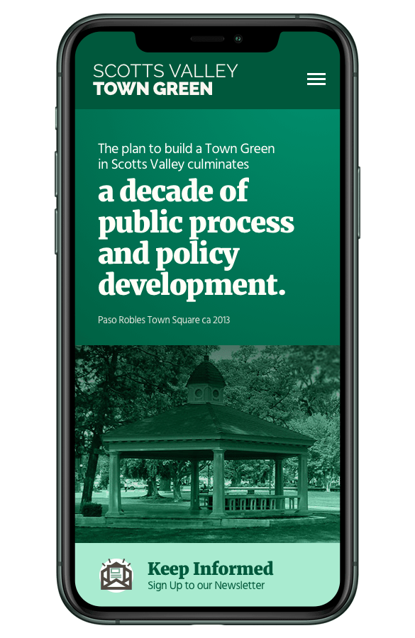
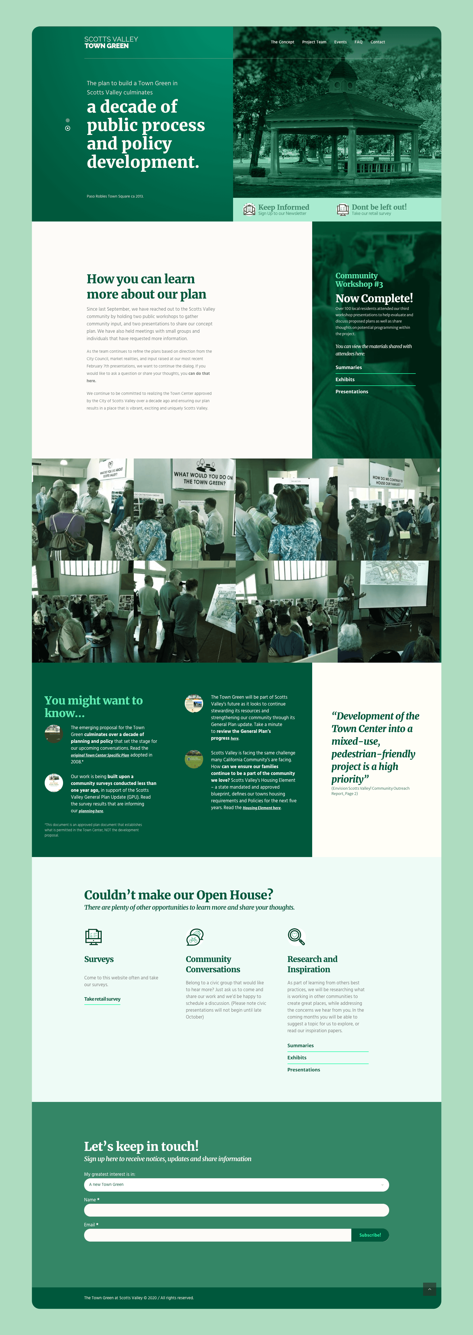
To evoke the feel of a welcoming community space, I selected photos of plazas, green spaces, and vibrant public areas from around California. Choosing these images instead of the empty land made it possible to convey the vision of Town Green as a future gathering place rather than a basic real estate project.

Image
MOBILE-FIRST DESIGN + SCALABLE LAYOUT

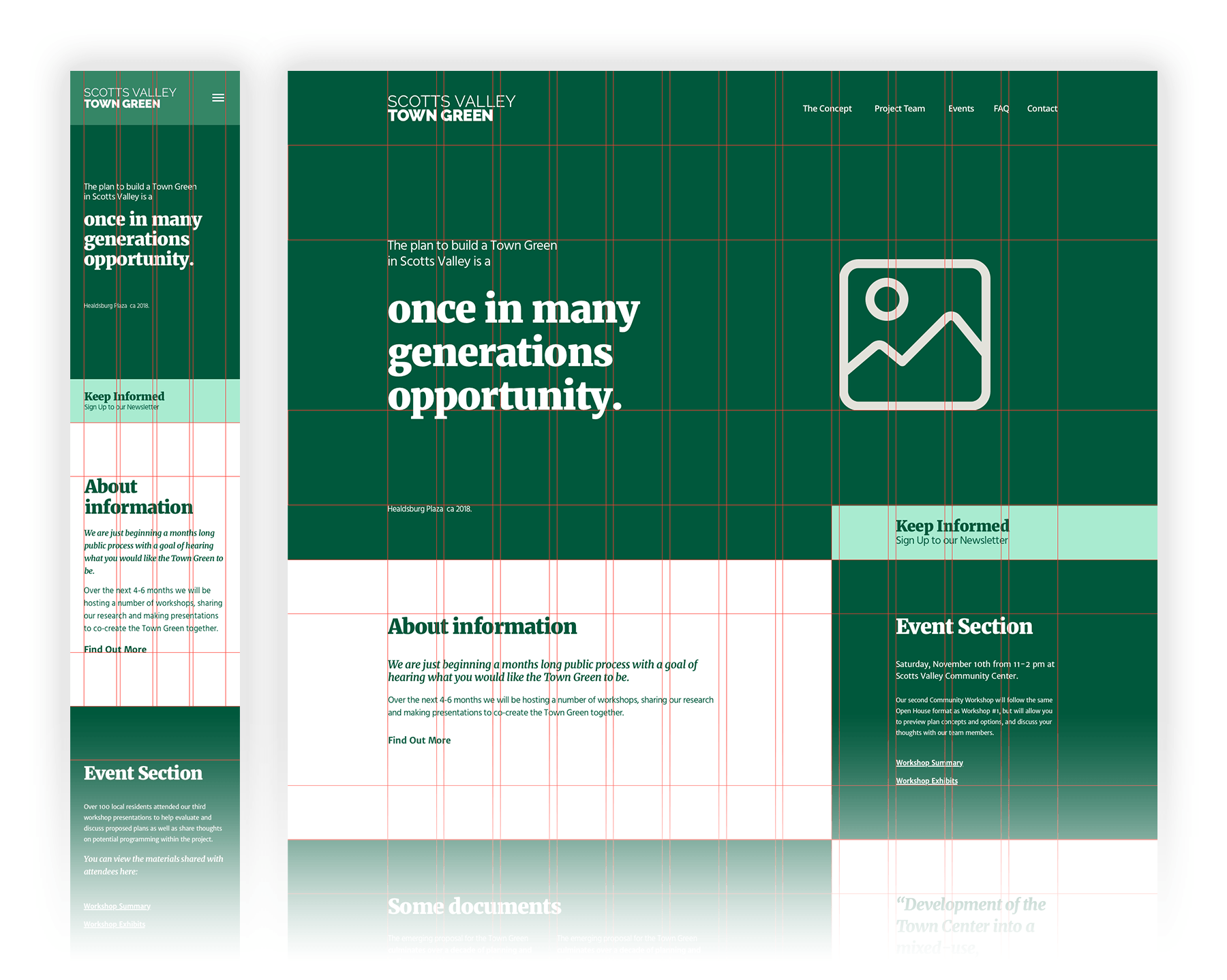
Starting with a mobile layout allowed for quicker prototyping and ensured accessibility for many users. Once the mobile foundation was solid, the design was easily expanded to a desktop version, making the site future-proof and responsive on all devices.

Image
Image
CLEAR INFORMATION ARCHITECTURE & PRIORITY-DRIVEN SECTIONS

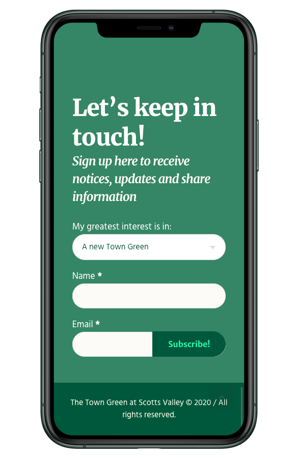
The site was structured with user and community needs in mind:

  • Hero section with a concise message + call-to-action (CTA) to subscribe.
  • Events section to list planned and past community events.
  • Opportunities / Involvement section for users who couldn’t attend events but still wanted to contribute or stay informed.
  • Subscription form with minimal required fields (to lower friction and maximize sign-ups).

This structure ensured that the site delivered the most important value, which was to connect the community with the development team in a clear and effective way.

Results & Impact

From August 2018 to February 2019 (6 months after launch),
the website achieved:
  • 125 survey responses
  • 181 email subscribers
  • 1,915 unique visitors
  • 3,617 online page views

These numbers demonstrate early community interest, strong engagement, and success in building a subscriber base, which is exactly what the site was designed to accomplish.

Image

Reflection & Lessons Learned

  • Speed + clarity wins: With limited time and no preexisting brand assets, prioritizing a clear layout, essential content, and a strong CTA made it possible to launch rapidly and still deliver value.
  • Imagery builds connection: Using evocative photos of community spaces helped communicate both the vision and the emotional tone of the project. This gave prospective residents a glimpse of what the place could become, even before anything was built.
  • Keep friction low: Minimizing required fields in the subscription form significantly helped lower barriers to sign-up. This is an important takeaway for any community-oriented or lead-generation site.
  • Start simple, iterate later: Launching a barebones but functional site on time created a foundation. Future iterations (with more content, features, or branding) can build on that foundation without rewriting everything.
Stats Made Simple for Everyday Athletes. Website redesign for a Chip Tuning company.